Landing pages for photography sessions only work when three things line up: the offer on the page matches the ad that sent the click, the page itself asks for almost nothing before it earns trust, and the follow-up after the form is submitted happens in minutes, not days. Most pages that look finished still fail because one of those three links is missing, not because the design is wrong. A photography landing page is the place a click should arrive when you want someone to see the work before they leave a name.
That’s the real gap: a page that looks right against a page that books sessions. If you already have a landing page and it isn’t converting, the fix is rarely a redesign.
Why a Good-Looking Landing Page Still Books Nothing.
A landing page gets judged the way a photograph gets judged, on how it looks. Clean layout, the right type, a session mentioned in the right place, and it passes every visual test. Then it sits there converting almost nobody, and the instinct is to blame the page: redesign it, swap the headline, try a new photo. None of that is wrong to try, and sometimes it helps a little. But it treats a system problem as a design problem, and design problems have a ceiling.
The page is rarely the whole problem. A landing page is the middle of three moving parts: the ad that sent the click, the page itself, and what happens after someone fills in the form. If an ad promised a family session and the page opens on furbaby portraits, the click already feels like a mismatch before anyone reads a word. If the page is flawless but nobody calls the lead back for two days, the booking was lost before the page gets any credit or blame. That mismatch and that silence are both invisible to anyone only looking at the page in a browser, which is exactly why they get missed. Treat the page as a standalone design project and you will keep polishing the one part that was never broken.
What Landing Pages for Photography Sessions Have to Get Right.
None of that means the page doesn’t matter. It does, and there’s a short, specific list of what it has to get right on its own, and skipping any one item on it costs bookings even when everything else about the studio is excellent.
- One offer. A page selling a family session, a pet session, and a general booking form all at once asks a skeptical visitor to do the sorting themselves, and most won’t bother.
- One call to action. A booking button, a phone number, an email address, and a chat widget on the same page scatters the one decision you actually need someone to make.
- Mobile-first, not just mobile-friendly. Most clicks a photography ad sends arrive on a phone, and a page that loads slowly or forces someone to pinch and zoom loses them before they see anything else.
- A trust signal a skeptical reader believes. Not a generic testimonial graphic, but something specific: a real photo from a real session, a detail about how the studio actually works.
- The least possible friction in the form. A name, a contact detail, and the one question that matters, family or pet, preferred timing, is usually enough. Every field beyond that is a reason to abandon halfway through.
Page speed and mobile design matter for a reason that has little to do with search rankings: a reader who has been burned by ads before is already looking for a reason to leave, and a slow load or an awkward form on a phone is exactly that reason. Imagery matters more here than copy, not less. A paragraph explaining why a studio is different doesn’t prove much to someone who has read a similar paragraph on another site. What proves it is seeing it: a session in progress, a family caught mid laugh, a dog crossing the set at full speed. That’s true whether the ad led with a family offer or a pet offer, the proof just needs to match the world the reader already lives in. It’s the same instinct that makes a studio’s own social feed worth following. People believe what they can see. None of this means over-producing the page. It means proving the studio is real before asking someone to trust it with a session.
What Happens After the Form Is Submitted.
This is the part every gallery of landing page examples skips, because it happens after the page has already done its job. Someone fills in the form. What happens next decides more about whether that person books a session than anything on the page itself.
A lead who just filled in a form is at their warmest point: curious enough to act, still thinking about the studio. Leave that lead waiting and the moment passes. Attention moves on, to whatever else is competing for it, including another studio’s form. Turning that inquiry into a booked session is a function of speed as much as anything said once someone actually gets on the phone.
The fix usually isn’t a faster person answering emails. It’s a system that captures the inquiry and follows up automatically, then keeps the conversation going until someone responds. None of this requires more staff, it requires the response to happen without waiting on anyone to be sitting at a desk when the form comes in.
Matching the Page to the Ad, Not Just the Niche.
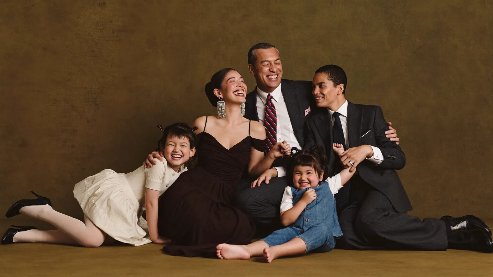
A family session inquiry and a pet session inquiry aren’t the same conversation, and one page trying to serve both with the same headline undersells each. A family exploring a portrait session wants to see what the finished wall art looks like in a home, and wants reassurance about how a child who won’t sit still gets handled. A furbaby owner wants proof the studio can handle an animal with the same patience and skill it handles a toddler, and wants to know the session won’t be stressful for the dog. Even the imagery each reader wants to see is different: an elegant family filling a beautifully lit studio room, or a dog mid-motion across the same set with an owner laughing in frame. Even the proof point differs: a family reads years in business and experience with children as reassurance, a pet owner reads experience specifically with animals the same way.
Marketing built for family sessions and marketing built for pet and furbaby sessions should look, read, and prove differently, because the person arriving from each ad is judging different things. A page built to do both jobs at once usually does neither convincingly.
A Quick Self-Check If You Already Have a Landing Page.
If a landing page already exists and isn’t booking sessions, the fastest thing to check isn’t the design. Ask three questions instead.
- Does the offer on the page match exactly what the ad promised, or is there a gap between the click and the headline it lands on?
- Is the page asking for too much before it has earned any trust, or loading too slowly for the phone it was clicked on?
- What happens right after someone submits the form, and is anyone, or anything, actually answering fast enough?
None of these questions require expensive tools to answer. Most photographers already know their own answer as soon as the question is asked, which is often the fastest diagnosis available. Most of the time the leak isn’t in one place either. A little is lost at each handoff: ad to page, page to form, form to follow-up. Fixing only the page fixes only one of the three. If the booking process itself needs work, that’s covered separately: how to book more photography clients. If you’d rather have someone map exactly where your own leak is happening before changing anything, that’s what Under the Hood exists for: a fixed price look at what’s actually costing you sessions, with no retainer attached.
How Studio Digital Builds Landing Pages.
We don’t build a landing page as a one-off project, because a page built alone drifts out of sync with whatever the ads are doing within a season. It’s one piece of a system: the Meta ad that sets the expectation, the page that meets it, a lead nurture system built for studios and what a photography CRM actually needs to do that follow up before a lead cools, and booking funnels built for portrait studios that carry a still deciding visitor toward a booked session. None of these four pieces is optional or an upsell added later, they’re what a full marketing department means in practice. That’s also why a landing page built by Studio Digital ties back to the ad it was built for and the CRM that catches what happens next, instead of arriving as a file to hand over and hope works with whatever platform a studio already uses.
Marketing for photographers only works when those four pieces, ads, CRM and automation, nurture, and funnels, are built to match each other, not assembled apart and hoped into alignment.
If your landing pages aren’t the problem but you suspect the system around them might be, that’s exactly the kind of studio we work with.
Apply for a spot